After researching for sometime for a suitable article, i came across this BBC article by Mukti Jain Campion. It details important points about my chosen artefact which is the swastika. he talks about the history, how it grew in popularity in the early 20th century and the effect it has to this day.
“For those like Freddie Knoller who have experienced the horrors of fascism, the prospect of learning to love the swastika is not so easy.”
How the world loved the swastika – until Hitler stole it – Mukti Jain Campion
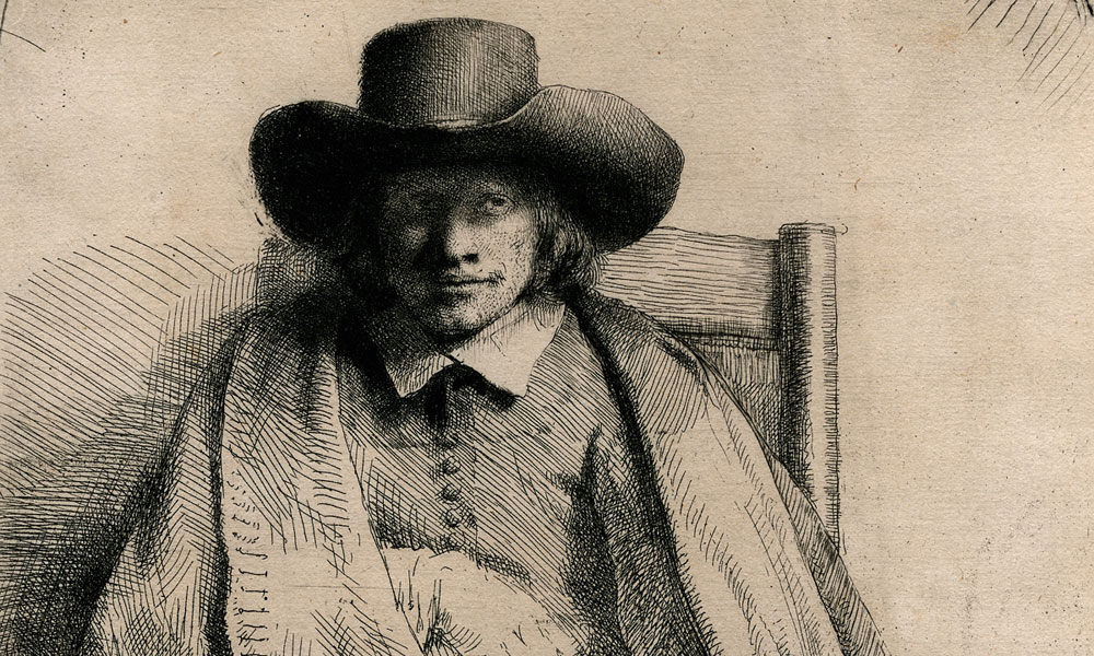
Otto Dix – German painter and printmaker who’s famous for his depictions of the grotesque First World War and The German Weimar Republic.
Looking at Dix’s prints of The First World War, you are immersed in this horrific world that is filled with death and destruction. To the viewers it shows the true nature of The Great War and acts as a sort of reminder that war is an evil thing which Dix wanted to convey.
When the Nazi party came to power in 1933, Dix was sacked from his role as an art teacher in Dresden and forced to work for Goebbels’ cultural ministry. Hitler saw Dix’s art as degenerate and an embarrassment to the German people. A few of his paintings and prints were burned and destroyed. These works almost seemed as a threat to the new regime as the work isn’t propaganda nor showing a fake reality of war.
In his painting “Flanders”, you have this clash of light and dark with some hellish, grotesque objects in the foreground. Again, he is creating this raw emotion by clashing a light and dark sky which creates an aura over this painting. This sense of calmness takes over even though it looks dangerous and hellish, you still feel like there’s hope. This represents his life during that conflict.
In his drawing “Prostitute and disabled war veteran. Two victims of capitalism”, It shows what a certain type of life was like after The Great War. The best thing about this drawing is that its not got any colour to distract you or any harsh areas to deter you, just plain ink to show the horror on their faces. Looking at it from this era you feel a sense of corruptness and sadness, these people’s lives were in poor shape and this sense of isolation hangs on it.
Finally, onto his “Der Krieg” triptych. It’s almost a response to the renaissance era of artistry. Capturing these different moments of time onto three panels. It reminds me of “The Garden of Earthly Delights” by Hieronymus Bosch. This is because it tells a story of marching onto battle, during the battle and the horrific scenes and then the aftermath and struggle. When you look at it this way, those old Dutch, renaissance and biblical triptychs often focused of heroism and mighty battles whereas Dix’s shows the reality of the battles and there are no heroes only death which is shown in all 3 panels in some form.
A few words from the reading groups I didn’t understand and their relevance to my discipline.
Modernism – “A style or movement in the arts that aims to depart significantly from classical and traditional forms”. In relation to my discipline of Drawing and Print, modernism is exactly that a movement or style. Modernism is broad and branches off into different ideas, styles and movements such as futurism for example.
Self-actualisation – “The realisation or fulfilment of one’s talents and potentialities, especially considered as a drive or need present in everyone.” In my discipline this is something everyone should use and conquer. To be able to realise your goals, targets and what you want to achieve whether it be to try a new technique or create masses of work, is important to not only my discipline but everyday life.
Zeitgeist – “The defining spirit or mood of a particular period of history as shown by the ideas and beliefs of the time.” Defining and understanding different periods is a step to understanding artists of the past. Being able to get something from a piece of art made in the Renaissance or some other distant history that relates to your modern way of thinking is incredibly important because as humans we need answers to everything. Questioning things is what we’re good at.
Banality – “The fact or condition of being banal; unoriginal.” Banality is something most artists have to deal with. Lack of interests or inspiration which has been given another form in the idea of “Artists block”.
Taking more from the fourth phase of being able to display an account to millions of people worldwide, it’s only natural for that to go further and for modern communication and our very own way of life to be made simpler but also more challenging. With instant messaging, video calls, voice activated AI we’re living in a world of progressing technological advanced world. Everyone has been giving a right to be able to broadcast themselves to their friends or to everyone leaving them vulnerable to “internet harm” in the form of trolls and hackers. In ways with technology advancing life has been made simpler from contactless payments to no longer skipping a song physical whereas you can ask Alexa or Siri to do so. With all advancements comes disadvantages, where 20 million people’s Lloyds bank accounts were hacked in just one of the many cybercrimes in the last 10 years. However, social media, gaming and other visual outlets have been filtered down to the younger generation with most children having access to ipads and mobile phones. This creates a sort of backlash from older generations because they see how technology and large amounts of time spent on it is not good for your health physically and mentally. From the late 00’s to current day a popular trend of “memes” internet jokes, have been widely used by the teens and young adults to joke about current trends and to poke sticks at major political events and mishaps. This along creates a community with some sites such as reddit gaining a wide following from these trends.
In this list I’m going to talk about TEN drawing and print artist’s in now specific order who influence my work and what it is about their work I value.
Katsushika Hokusai
Coming from Japan during the Edo period Hokusai was a master print maker. He is well known for his “36 Views of Mount Fuji” which includes “The Great Wave”. This particular print is a somewhat phenomenon in the modern world being reproduced and reinterpreted onto clothing, posters, logos and even as tattoos. I guess what I value the most about Hokusai is the change he brought in Japan. He changed the way that Japanese people at the time being secluded from the western world, looked at art. Also his “36 Views of Mount Fuji” Landscape series was the first of its kind to create woodcuts of landscapes. He was a pioneer, even his work was appreciated and shared in the western world.Also, the famous artist Vincent Van Gogh was said to collect Hokusai prints.
The Great wave off Kanagawa, Woodblock Print by Hokusai, 1833
Lice4Life
Simon Lice, more commonly known as Lice4Life is an Melbourne born Australian Wood-cutter and print maker. For the past couple years he’s been building a following online and in the tattoo community. He draws and prints a range of imagery that he finds interesting from skulls to insects. He is influenced by collage art and old punk album covers, he also states a main inspiration for his prints is Victorian medical anatomy illustrations. What i value from Simon’s work is the dedication to mastering a practice. To limit yourself from expanding further until you’ve mastered the basic steps is a great way to learning and a way to feel accomplished.
Simon Lice working in his Australian Studio, 2018
James Castle
He was an American artist who died in 1977. He was self taught who created loads of drawings and books of drawings. He was deaf and attended a special school in Idaho but it isn’t known to what extent he could read or write. He painted various objects, landscapes and people. He created them using a wide range of materials such as soot and spit, paper he found in the trash and ink. I really love his book works and portraits of people, the expressions and composition of each drawings give them life and developing drawing into something new.
Untitled, Soot on found paper by James Castle, Date Unknown
Sybil Andrews
She was an English born Canadian who specialised in print making. Specifically Lino cuts. She collaborated with Architect, Cyril Power and together they worked at a studio they shared. She was influenced by vorticism and futurism. A main theme throughout her work is movement, all of her prints have this sense of moving and energy. I really value her effort of planning her prints through taking care and consideration into each print which I try to aim towards in my practice.
Racing Print, Lino Print by Sybil Andrews, 1934
Peter Doig
He is a world renowned Scottish painter who has exhibited at The London National Gallery. His works range from paintings to dry points to plain drawing. They all have this sense of being lost and feeling vulnerable. I value the way in which he experiments with different practices and not just sticking with painting. It really broadens when turning a painting into prints because it gives a new perspective of what he is trying to get across.
Almost Grown, Painting by Peter Doig, 2001
Paul Morrison
He’s a contemporary British Artist known for his methodical black and white paintings and prints. He has been shortlisted for a few awards including the Jerwood Painting prize. His works have been exhibited in LA and London. He creates these large scale botanical themed prints in a disproportionate way making flowers and plants seem larger than buildings. I really adore the black used in his work, it’s so thick and makes the white come alive and scream at you. It’s a clever way utilising the white and black areas.
Gamodeme, Acrylic on board by Paul Morrison, 2006
John Virtue
John is a British painter who paints monochrome landscapes. From 1985, He worked as a full time artist giving up his day job. He maintains a studio in Devon and has done an exhibition at The National Gallery on his famous painting series “London Paintings”. He used black ink and charcoals to create London skylines but adding in a smoky and eerie effect by creating this smoggy atmosphere. What I value from his work is the fact that it provokes the viewer into thinking and questioning the work, it’s a good way to engage with your audience and get across a message through paintings.
Landscape Number 710, Ink on canvas by John Virtue, 2003/4
Linda Kitson
Linda is the first female war artist during the Falklands conflict. She was commissioned by The Imperial War Museum to accompany a task force in the Falklands. Over 3 months of treacherous terrain and dangerous war zones, she would create over 400 drawings using just conte crayon. I admire her work but also her bravery to be there at the front and record such a brutal thing.
Sir Galahad moored at Fitzroy. She continued to burn until she was towed out to sea and sunk as a War Grave, Linda Kitson, 1982
Alan Davie
Another Scottish painter who creates these colourful paintings that are inspired with spontaneity. After reading Eugen Herrigel’s “Zen in the art of Archery”, He became obsessed with spontaneity and assumed that planning ahead isn’t the way to be working. His paintings were not abstract as he would say they had symbolic meaning. I find his way of working to be useful, for example having artist block and not knowing where to go is frustrating but to just let loose and do whatever comes to your mind is helpful in a way and gives you a lot of opportunity.
ZURICH IMPROVISATION XIII, Lithograph by Alan Davie, 1965
Larry Rivers
He was an American musician, artist and film maker. He is widely considered to be the godfather of the pop art movement. He is known for transforming famous Rembrandt’s and Manet’s into something new using different layering techniques and whole new ranges of colour. i’m really interested in his layering working and political provocation. He really pioneered this look of pop art and made his own statements through it. I value his creativity, to layering images on top of paint and making things flow and work really engages me.
Black Revue, Screenprint by Larry Rivers, 1970
“Art, like life, should be free, since both are experimental.”
– George Santayana